

Creme blush makes me happy – it doesn’t make skin look dry, it (usually) diffuses perfectly on the skin so it looks very natural and fresh. I occasionally use a powder blush, but nine times out of ten, I turn to a creme of some sort. I don’t think that it’s hard to tell when a product has a proper make up artist behind it and in particular when it comes to colours. There’s something for every tone here.

I’ve worn a couple of the shades – they give a dewy finish that’s very light (obviously the lighter the tint, the lighter the diffusion will be) and seamless but if you’re not a fan of dewy they’re not for you.

I use a big brush (currently the Clinique foundation brush which I LOVE – it’s HERE) to get the right level of tint and have used on bare skin, over foundation and over tinted moisturiser.. there’s nothing they’re not working on). Actually, I think they’re a nice holiday buy – so easy, and even at the price (expensive) of £24.50, small and portable.

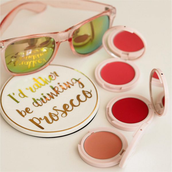
Shades from bottom to top: Scarlet, Sunny, Bloom, Poppy, Rosy and Petal. They’re on pre-order at BeautyMart HERE.
Non Aff HERE
Transparency Disclosure
All products are sent to me as samples from brands and agencies unless otherwise stated. Affiliate links may be used. Posts are not affiliate driven.
9 comments
Scarlet is right up my alley at the moment – love a of a touch of bright red blush with a tanned face, makes you look like you’re fresh from a day out in the sun 🙂
@Kerrykegs
These remind me of the Bobbi Brown Pot rouge. Are they comparable?
No, completely different texture – these are more silky and light. x
I haven’t used cream blush in years but these look like fun! Maybe I should give it another go…
http://www.BlushandPearls.com
These look really nice and I’m not usually into creme blushes. A lovely range of shades.
I have always loved a cream blush, especially as I’m now ‘mature’. Really liking the look of these.
Wow – good to see the swatches, because the descriptions and images on the Dempsey website don’t jibe with what I’m seeing here. Rosy is described there as a “deep rose… I just worked out… ideal for medium and dark skin tones” but your swatch has it looking like a neutral brownish peach.
There’s often a colour discrepancy when you use different cameras – I try to get mine as accurate as possible but there’s inevitably some variation. x
I think the order is wrong. It should be: Shades from bottom to top – Scarlet, Sunny, Bloom, Poppy, Petal and Rosy.