
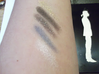
Finally, I have my hands on the Karl Palette – it’s all things lovely but I kind of expected it to be low on pigment, and it is. That’s not such a bad thing; the darker shades in particular are pretty powerful with heavy pigment, so while these take a little more effort in application if you do want to go super-dark, they’re actually good for buildable nuance. The lighter shades are fine; the white shade is a perfect pearly shimmer and the gold is beautiful for little highlights on the inner corner.


Leave a Reply